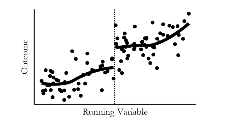
This is a thread of me QTing myself so I can pin all my posted-on-Twitter projects. Causal inference animated graphs:

As requested, slower graphs! Also added a graph on collider bias, the webpage explanation helps there. These graphs are intended to show what standard causal inference methods actually *do* to data, and how they work. This is what controlling for a binary variable looks like: